
Paint A Book From A Brick - Craft Room Secrets
- Sarah Ickes

- Jun 25, 2025
- 6 min read

This past weekend, I had the pleasure to teach a class on how to paint a regular concrete paving brick into a book that can be placed in a garden, used as a doorstop, or a book end. It was such a fun afternoon, and everyone was so creative with their designs! If you are interested in doing this yourself at home, you can do so through the following instructions listed below.
Disclaimer: I am not held responsible for any damages to yourself, or any object in your house, should you decide to give this craft a try. This is just a suggestion, nothing more.
My Supply List: (none of the following links are monetized)
concrete brick (purchased through a home improvement store or found in your yard)
brushes (of varying sizes and tips)
outdoor acrylic paint (in different colors)
white gesso paint (or black gesso paint)
cup of water
outdoor sealer (of your choice)
paper towels
Optional:
paint pens or permanent markers
stencils
**all of the product links are owned by their respective parties, and I claim no ownership nor am I affiliated with their companies in any way. All of my opinions in this post, and blog, are of my own doing and are not reflective upon any of the companies mentioned.
One Thing to Note: While I did purchase my bricks at a home improvement store, you could use any bricks found in a yard or leftover from another construction project. These bricks may need more cleaning, as that part depends on what dirt is found on them.
Step 1: Clean the brick with water and let it dry. For mine, they were purchased from the home improvement store and only needed a good rinsing to clean off a majority of the dust. You may have to use a scrub brush with some soap if your brick is very dirty.
Step 2: Apply your white gesso until almost all of the cracks and crevices have been covered. Remember, with the texture of the rock, it is not going to look perfect. It's okay if you can still see some spots showing through the coat of primer.
Now, for the ones I prepped for the class, I did every side except the back...for a good reason. If you would like to apply a piece of felt, for use as a doorstop or bookend, then the rougher surface is better for adhering to. If you would rather use it for your garden instead, you still don't have to prime the underside since you can just coat it with a brush-able sealer at the end; or you can leave it untouched.
As for the gesso, there are two options to use here: white or black. For the bricks, I used the white option because it helps to brighten the colors. But I do prefer the black gesso for many of my projects simply because it already creates a natural shadow without me having to do any extra work.
The choice is yours!

Step 3: Next, you let the gesso dry on the brick so that it doesn't come through when you go to apply the main color you want your book to be. No matter which color you pick, you can even use a specific book as a reference, you should start with a color scheme and an idea of the finished look you wish to achieve.

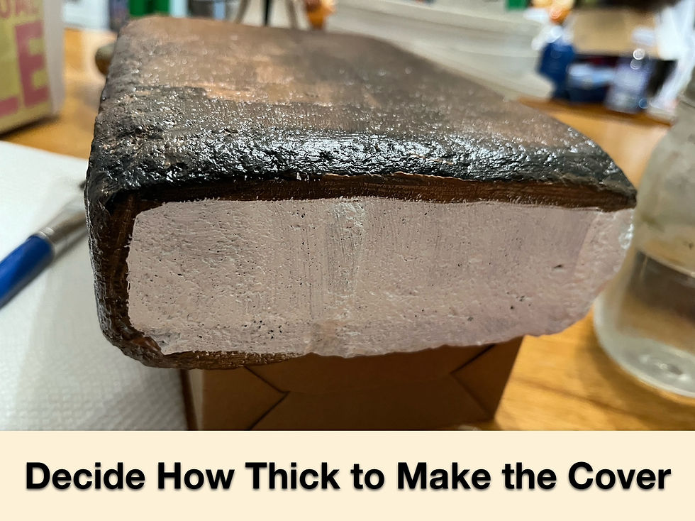
Step 4: Start painting the front cover of your book, and then decide upon how thick your cover is. You can either paint just up to the edge of the front cover, or you can go below like I did in the following image. The white section will be the pages at the end, so leave that alone in case you make a mistake, or need to turn the rock while you paint.
Step 5: Once you have the main color finished, you can either begin to paint the other details right away, or you can wait until it is dry to add the rest. I went right into the rest of my details because the color scheme would work if the under-color shone through. This is also the most fun part, in my opinion, as you get to experiment with different objects to see where your imagination takes you! (If you have stencils, permanent markers, or paint pens, this is where they are most helpful.)
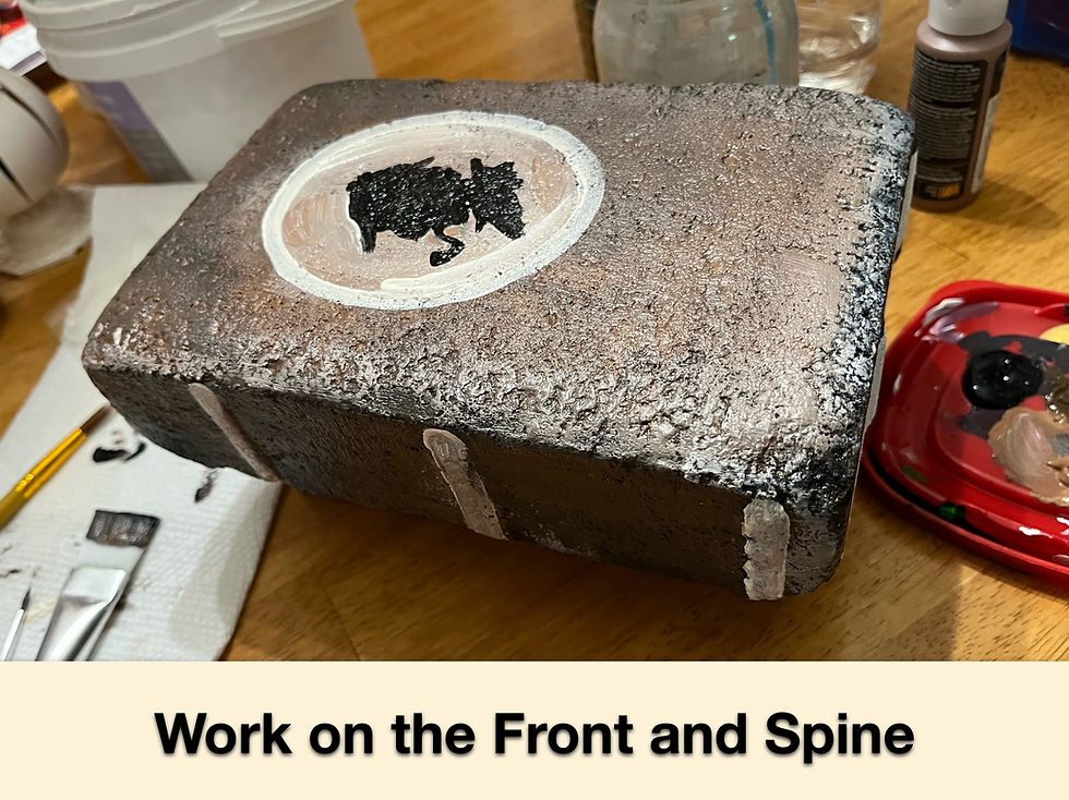
Step 6: The next step is to tackle the lettering, if you want a title on your front cover. Not everyone puts words on the cover, and that is alright too. But if you choose a word, or phrase, remember to space everything out BEFORE you paint it on. Even if you give yourself little pencil mark perimeters, or dots for the top and bottom of the letters, it is still better than starting to paint, only to then realize that you didn't leave enough space or your words are sloping as you go along!
Highlights and shadows are done at the end of the lettering and finer details. The book in the following image has an "illustrative" style to it because I used thicker black lines throughout the piece. This is purely the artist's preference and doesn't have to be done.
(Artist Tip: when incorporating metallic paints, it is best to do two coats, since it is more transparent than mixed colors.)

If you wish to have a more worn appearance on your book, simply take a dry brush, dab the bristles into a lighter color, and then apply sparingly to the areas that are naturally worn on a book over time. Example: the spine, edges, and corners of the book.
Important Side-note: Now, you can stop at this point and leave the pages as a white block of color, as some books do look when they are freshly printed. But if you would like to continue on and paint in the edges of the pages, then feel free to keep on scrolling. 😃
Step 7: Finally, I prefer to use a round tip for the pages, and this is the best way I can explain what I do to achieve this look: Load part of your bristles with white (warm, stark, eggshell, etc.), along with brown or grey, having not mixed them thoroughly together. You want them partially blended, but not fully, as the differences in the strokes will naturally give you the pages in the end. Allow the paint to do most of the work for you, and don't worry about making perfect lines across the entire surface.
Our eyes are mischievously tricky. When a line is exactly straight, they perceive them to be slightly bowed, and slightly bowed lines are seen as straight. That is why the Greeks make their pillars have a faint curve to them, as they realized what perception at a distance distorts what we see.
Be sure to make your lines go around all three of the white-primed sides, and remember that paint is a very forgiving medium. You can cover over mistakes many different times until you reach the look you want for your book.
(Artist Tip: I find that many layers helps to develop subtle depth within a piece, and a more polished final product that gives it that extra dollop on top. A thin black line along the edge of the cover also adds a little shadow effect right above the page edges.)

Step 8: Take a picture and smile that you have completed the project! Whether it is for your garden, as a door stop, to be a bookend on a shelf, or as an extremely heavy paperweight, be proud of what you have just created!
Here are some pictures of the ones that were created during the class!

A family of four had come to paint together, and they did a great job!

I love that these were inspired by nature! (one is even a guardian for flowers 🌸)

Everyone was so creative, and all of the books had such character!
All in all, it was fun afternoon with a quick clean-up at the end. And...there was so much generated interest in having another class, that I have agreed to do one in the Fall as well. Though a date has not be determined at the moment, I look forward to seeing what the other books will become. For the only limit in what your brick will be, is the depth of your imagination! 😉

Photo collage of the workspace, bookshop sign, and my example for the day.

The official promotional image for the class.
A big shout out of thanks goes to the Mechanicsburg Mystery Bookshop, who provided the space and required facilities for this class.
That's all for now! See ya next time! #crafts #inspiration #bookcrafts #books #bricks #painting #readers #creativity #frontcovers #gardendecor

Hồi sáng nay trong khi mình đang đọc các bình luận trao đổi trên mạng, mình thấy MM88 COM được chèn vào và được mọi người nhắc tới nhiều. Mình bấm xem cho biết, để xem cách trình bày và cấu trúc nội dung. Lướt nhanh thì thấy tổng thể khá gọn gàng, tạo cảm giác đáng tin cậy. Với mình, chỉ cần nội dung gọn gàng như vậy là đủ để mình nắm bắt thông tin cơ bản.
Trong lúc đọc một số bài viết và bình luận trên diễn đàn, mình thấy Nhà cái RR88 được nhắc đến nhiều lần nên quyết định vào tham khảo thử. Mình chủ yếu xem qua giao diện tổng thể và cách sắp xếp các nội dung trên trang. Cảm nhận ban đầu là bố cục được trình bày khá rõ ràng, các danh mục được phân chia hợp lý nên việc theo dõi thông tin không quá khó khăn. Giao diện nhìn tương đối gọn gàng, các khu vực hiển thị được sắp xếp ngăn nắp và dễ quan sát trên cả máy tính lẫn điện thoại. Dù mới chỉ trải nghiệm ở mức cơ bản, mình thấy cách tổ chức…
Mình tình cờ đọc thấy Trang chủ XX88 khi xem qua một vài bài thảo luận trên mạng, thấy cũng được nhắc đến khá nhiều nên mở thử lúc rảnh. Ban đầu chỉ lướt nhanh qua để xem cách bố trí và sắp xếp nội dung tổng thể. Cảm giác đầu tiên là giao diện được trình bày khá gọn, các mục phân chia rõ ràng nên không bị rối mắt
Habang umiinom ako ng kape, nagbabasa ako ng mga komento at talakayan sa internet nang mapansin kong madalas banggitin ng maraming tao ang GINASTE Dahil nacurious ako, binuksan ko ito upang makita kung ano ang mayroon dito. Sinuri ko ang paraan ng presentasyon at ang pagkakaayos ng nilalaman, at sa kabuuan ay maayos at organisado ito. Mayroon din itong iba't ibang uri ng libangan, kasama ang isang kaakit-akit at madaling gamitin na interface. Para sa akin, sa pangkalahatan ay magaan at madaling maunawaan ang paraan ng pagpapahayag nito.
Kapag nagbabasa ako ng mga artikulong nagpapakilala ng mga entertainment platform, mas gusto ko ang mga maikli at diretsong paliwanag. Madaling sundan ang pagkakaayos ng artikulong ito dahil ang bahaging tumutukoy sa https://superacephi.com/ ay inilagay sa gitna ng nilalaman. Nakatuon ang nilalaman sa pangkalahatang karanasan ng mga gumagamit, kabilang ang madaling gamitin na interface at iba't ibang pamilyar na kategorya tulad ng slot, card games, at mini games. Magaan, malinaw, at madaling maunawaan ang paraan ng pagkakasulat nito.